inherit
220892
0
May 21, 2019 7:56:43 GMT -8
Morgan
69
April 2015
insurrection
|
Post by Morgan on Jul 8, 2015 23:25:42 GMT -8
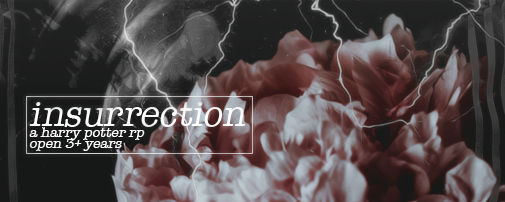
Hey guys! I would love some opinions on my and my beautiful co-admin's Harry Potter RP site. It's almost three months old... aww such a little.. forum-child! Open for opinions on absolutely anything that comes to mind including the banner (my Photoshop skills are certainly sub-par at best), colors, the skin (which was made by Angelic Girl of Shadowplay, who is a goddess), set-up, etc. Outside and unbiased opinions are the best opinions in my mind! Insurrection | A HPRP
Thank you all of you beautiful, beautiful people! <3 |
|
slypi
New Member

Posts: 7 
inherit
223218
0
Jul 13, 2015 13:25:53 GMT -8
slypi
7
July 2015
slypi
|
Post by slypi on Jul 12, 2015 0:25:14 GMT -8
Its good, congratiulations
|
|
inherit
213098
0
May 10, 2020 17:43:38 GMT -8
Lord Eorr
54
August 2014
imperialcovenant
|
Post by Lord Eorr on Jul 12, 2015 7:58:09 GMT -8
Hello, Starting off I'm going to say the skin looks great. But I can tell you what I hate immediately and that is the color choice of blue for your "Magical Abilities". There is a serious color friction going on and it hurts the eyes to stare at them and try to read what they say. I'd suggest something not so hard(?) in color. The banner doesn't make much sense to me, when I look at it I see a HP character, the guy from Shoot Em Up, and some kinda random person in the middle. It doesn't give the vibe of HP at all to me, but if they have reason to be the main attraction in the banner then I'm sure your site goers understand it. Style wise I'd say it looks pretty good for someone who claims to be sub-par. I absolutely hate your Voting & Media sidebar. They really take away the great skin you have with the neon blue ProBoards topsite, and the white vote for us sign. Things like that I believe should be tucked away in a board for your members to vote for in nice link form. Overall I believe your site looks astonishing. Just that blue color of choice kills me  |
|
inherit
220892
0
May 21, 2019 7:56:43 GMT -8
Morgan
69
April 2015
insurrection
|
Post by Morgan on Jul 12, 2015 23:00:30 GMT -8
Thank you slypi! Lord Eorr: Thank you! I really like the skin as well and was lucky to find it on Shadowplay. I will definitely change the color of blue we use for magical abilities, I can definitely agree that it's a little harsh, but I didn't know if that was just me so I'll go find a more mellow blue as soon as I can! The banner.. yeah, I can understand how that would be random without knowing the site plot! They're the three major players in it. The guy from Shoot Em Up (though actually, I just googled and that's not the same guy, but they look crazy similar! This is Dylan McDermott) is the Minister of Magic and the random guy in the middle (Daniel Day-Lewis, if you were wondering  ) is the Death Eater in charge of the rebellion that is forming! So, if that helps to clarify that a bit more! Also thank you for the tip about the voting and media, I will definitely at least move that to the bottom of the page by affiliates maybe, or find a different board for it though that might affect how often people vote.. I'll muse on it! Overall, thank you so much for the opinions!! I really appreciate it! Also! Just got a new banner from someone on Proboards Support, don't want to randomly tag a person but they did an amazing job so now the banner is improved as well! Yay!  |
|
inherit
222028
0
Jun 24, 2022 14:34:52 GMT -8
MisforM
41
June 2015
misform
|
Post by MisforM on Jul 15, 2015 8:41:36 GMT -8
First Impression: Nice colors, looks nice on the surface. Looking Deeper: Too many words. To me it feels awfully crowded, and almost claustrophobic because of it. I think there's a plugin to move the ad to the top of the page, and that might look better, because as it is now, the banner looks disconnected from the rest of the forum. The sidebar seems unnecessary because it is so short. The whole words thing might help if images were added in there to make it look... more inviting, I think that's what I'm going for. Kind of like, the one with the events, it seems so small. Maybe instead of just words, something like this, and have the image be the link to the thread. I don't know if its hidden because of the whole summer break thing, but where's Hogwarts? I figure its because of the whole summer thing, but I dunno for sure. If so, then, no big deal. If not, and its just hidden for guests, then I wouldn't hide it from guests so they can check out whats going on and such. Other than the lack of images, and overload of words, I think it looks great. |
|
inherit
220892
0
May 21, 2019 7:56:43 GMT -8
Morgan
69
April 2015
insurrection
|
Post by Morgan on Jul 16, 2015 20:37:45 GMT -8
MisforM: Too many words.. thank you! That's definitely something for me to work on, and I like the idea of the picture for the events part, I'm going to go change that right now! That's definitely something that is hard to see at present time since it's such a small little side bar! I'll look for the plugin to move the advertisement, gracias! And yes, Hogwarts is hidden currently because there's summer, and aesthetically I didn't want guests to have to scroll through such a long board that's completely empty since only staff/ghosts/etc. post there and it's very sparse currently! Thanks!
|
|
inherit
220892
0
May 21, 2019 7:56:43 GMT -8
Morgan
69
April 2015
insurrection
|
Post by Morgan on Aug 29, 2015 18:20:01 GMT -8
bump  |
|
inherit
220892
0
May 21, 2019 7:56:43 GMT -8
Morgan
69
April 2015
insurrection
|
Post by Morgan on Nov 5, 2015 19:37:11 GMT -8
Bump |
|


 ) is the Death Eater in charge of the rebellion that is forming! So, if that helps to clarify that a bit more! Also thank you for the tip about the voting and media, I will definitely at least move that to the bottom of the page by affiliates maybe, or find a different board for it though that might affect how often people vote.. I'll muse on it! Overall, thank you so much for the opinions!! I really appreciate it!
