inherit
243495
0
Nov 26, 2023 14:10:25 GMT -8
EdgyOnyx
105
April 2017
kfp01
|
Post by EdgyOnyx on May 21, 2017 18:42:14 GMT -8
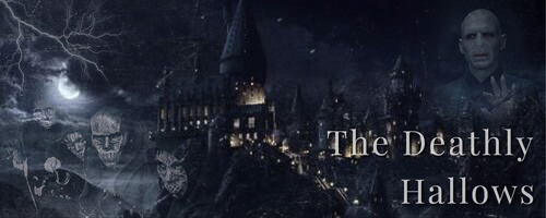
I have been noticing many guests coming to my site but none have been joining. Is there anything that you can see on my site that would make you hesitant to join? I am open to all suggestions and comments about my site, in order to improve.I ask that you please take the time to look at my site to review it. If you click the photo, I have linked it to my site. Thank you! |
|
inherit
212610
0
Jul 18, 2017 9:27:35 GMT -8
writersblock
18
August 2014
writersblock
|
Post by writersblock on May 22, 2017 19:39:57 GMT -8
Hey EdgyOnyx ! Here's my review of your site. Initial impression: Cool banner image, interesting color palette Likes- Like I said above, cool banner image. It's subtle, which compliments the overall mood of the layout design very well.
- I like the hover effects you use throughout the site for various links - super fun!
- Having an "open threads" thread and linking it in the main site header is a great idea. It'll encourage people to make and participate in open threads, and feel more included faster.
- LOVE that you have a Roleplaying Guide. I think a lot of people take for granted that people just... can roleplay or can't. It's not always intuitive. You have some fantastic content in there that's easy to follow.
- You have a great variety of places for posting. The places themselves can inspire posts, and that organization makes it easy to know exactly where something is taking place, and thus if my character can wander in.
Room for Improvement- Colors: The green, when used for text, is too dark in your overall navigation/news and in the headings under "Forum Information and Statistics". I think also that the red is too bright EXCEPT for when it is used as a hover color. Maybe darken the red a bit and use the same blue/green color throughout, or consider changing the green for text. Also, why not add a pop of the yellow from the banner somewhere in there to tie that in?
- The text on the home page is overall too small. The headers are all fine, but the board descriptions, subboards, and top navigation bar all are difficult to read at their current size.
- Having topsites is fine and often necessary for new sites, and I get that you want your members to help bump them - but don't put it quite that front and center. It takes up a huge section of the top of every page, prime real estate that you could be using for interesting/informational content. If you want to keep them up top, maybe relegate them to a smaller section off to the side, or otherwise put them on the bottom or side of the page. Also, it's a good idea to make sure they open in separate internet windows so members aren't being taken off your site (add the target="_blank" bit as in [*a href="WEB URL" target="_blank"][*IMG][*/a]).
- SUPER minor thing #1: Put the "Getting Started" subboard at the top under "General", so it's literally the first thing newbies see.
- The gradient account names are cool, but hard to read in the shoutbox. Also, what purpose are they serving? Just looking cool? Since your character group names (Hogwarts Staff, Second Year, etc.) aren't displayed when characters post, I would have no idea at a glance if my character could be in the same vicinity as yours. I have to click into your profile, which is a lot of work every time I see a new person. Designating these colors for specific groups can help with that, or letting titles be displayed in posts.
- SUPER minor thing #2: Your link for "rules" in the "Intro" thread doesn't work.
- SUPER minor thing #3: In the "Intro" thread, you say new character applications are to be posted in the sorting hat, although it seems the exception to this is for adoptables. Consider adding a line and link in about that?
- Maybe add a link to the "Who's Who" thread in the main links?
- SUPER minor thing #4: In the "Intro" thread, add a little greeting before getting right down to business. A simple "Hey, welcome to Deathly Hollows!" can go a long way for newbies. Keep in mind that this will likely be the very first thing prospective members read, so it should be both friendly and informative.
- SUPER minor thing #5: Most of your boards don't have "the" in the title, but a random few do. Keep it consistent. Same with subboards.
- Your theme is sparse, which is cool, but consider adding a few board descriptions - even if they're short.
What if I'm a Ravenclaw and don't remember what Ravenclaw Tower looks like, or don't know what exactly TerrorTours is? (I actually don't know these things although I am a HP fan!) - SUPER minor thing #6: Your welcome at the top, "WELCOME TO, The Deathly Hallows". I don't think it needs a comma, and should either be all caps or title case.
Overall: I think you have a really great start and are doing some interesting things. Good luck! |
|
inherit
243495
0
Nov 26, 2023 14:10:25 GMT -8
EdgyOnyx
105
April 2017
kfp01
|
Post by EdgyOnyx on May 23, 2017 17:11:08 GMT -8
Bump
|
|
inherit
243495
0
Nov 26, 2023 14:10:25 GMT -8
EdgyOnyx
105
April 2017
kfp01
|
Post by EdgyOnyx on May 25, 2017 11:18:21 GMT -8
Bump
|
|
inherit
243495
0
Nov 26, 2023 14:10:25 GMT -8
EdgyOnyx
105
April 2017
kfp01
|
Post by EdgyOnyx on May 27, 2017 14:26:02 GMT -8
Bump
|
|
inherit
243495
0
Nov 26, 2023 14:10:25 GMT -8
EdgyOnyx
105
April 2017
kfp01
|
Post by EdgyOnyx on May 14, 2018 4:14:08 GMT -8
Bump
|
|
inherit
243495
0
Nov 26, 2023 14:10:25 GMT -8
EdgyOnyx
105
April 2017
kfp01
|
Post by EdgyOnyx on Jun 18, 2019 19:35:13 GMT -8
bump
|
|
ToriJ
New Member
 Resident Critic
Posts: 67
inherit
259050
0
Jul 27, 2022 9:25:09 GMT -8
ToriJ
Resident Critic
67
July 2019
torijenova
|
Post by ToriJ on Jul 27, 2019 16:40:09 GMT -8
Hello. Right off the bat I like the look of the site. The banner is nice and the colors work well. I also like how the site links are on the banner. You may want to consider making some boards sub-boards because you have too many on the main page and that can be bothersome for guests. It's good to start out small and grow as your site does. You may also want to consider posting in the empty boards so you have more topics. Even if it's just a description of the board itself. Good luck on your forum.  |
|
inherit
243495
0
Nov 26, 2023 14:10:25 GMT -8
EdgyOnyx
105
April 2017
kfp01
|
Post by EdgyOnyx on Dec 6, 2019 17:55:43 GMT -8
Bump
|
|
inherit
243495
0
Nov 26, 2023 14:10:25 GMT -8
EdgyOnyx
105
April 2017
kfp01
|
Post by EdgyOnyx on Dec 8, 2019 7:03:35 GMT -8
bump
|
|
inherit
243495
0
Nov 26, 2023 14:10:25 GMT -8
EdgyOnyx
105
April 2017
kfp01
|
Post by EdgyOnyx on Dec 9, 2019 8:00:27 GMT -8
bump
|
|
inherit
243495
0
Nov 26, 2023 14:10:25 GMT -8
EdgyOnyx
105
April 2017
kfp01
|
Post by EdgyOnyx on Dec 11, 2019 21:10:35 GMT -8
bump
|
|
inherit
243495
0
Nov 26, 2023 14:10:25 GMT -8
EdgyOnyx
105
April 2017
kfp01
|
Post by EdgyOnyx on Dec 13, 2019 9:22:01 GMT -8
Bump |
|
inherit
243495
0
Nov 26, 2023 14:10:25 GMT -8
EdgyOnyx
105
April 2017
kfp01
|
Post by EdgyOnyx on Dec 14, 2019 15:50:39 GMT -8
bump
|
|
inherit
243495
0
Nov 26, 2023 14:10:25 GMT -8
EdgyOnyx
105
April 2017
kfp01
|
Post by EdgyOnyx on Dec 15, 2019 17:48:07 GMT -8
bump
|
|