telh
New Member

Posts: 27 
inherit
255319
0
Apr 3, 2020 15:53:30 GMT -8
telh
27
June 2018
telh
|
Post by telh on Jun 9, 2018 16:14:30 GMT -8
Link to the site: culturev1.boards.net/This is what the thread looks like when you aren't posting (this is what the whole site looks like) 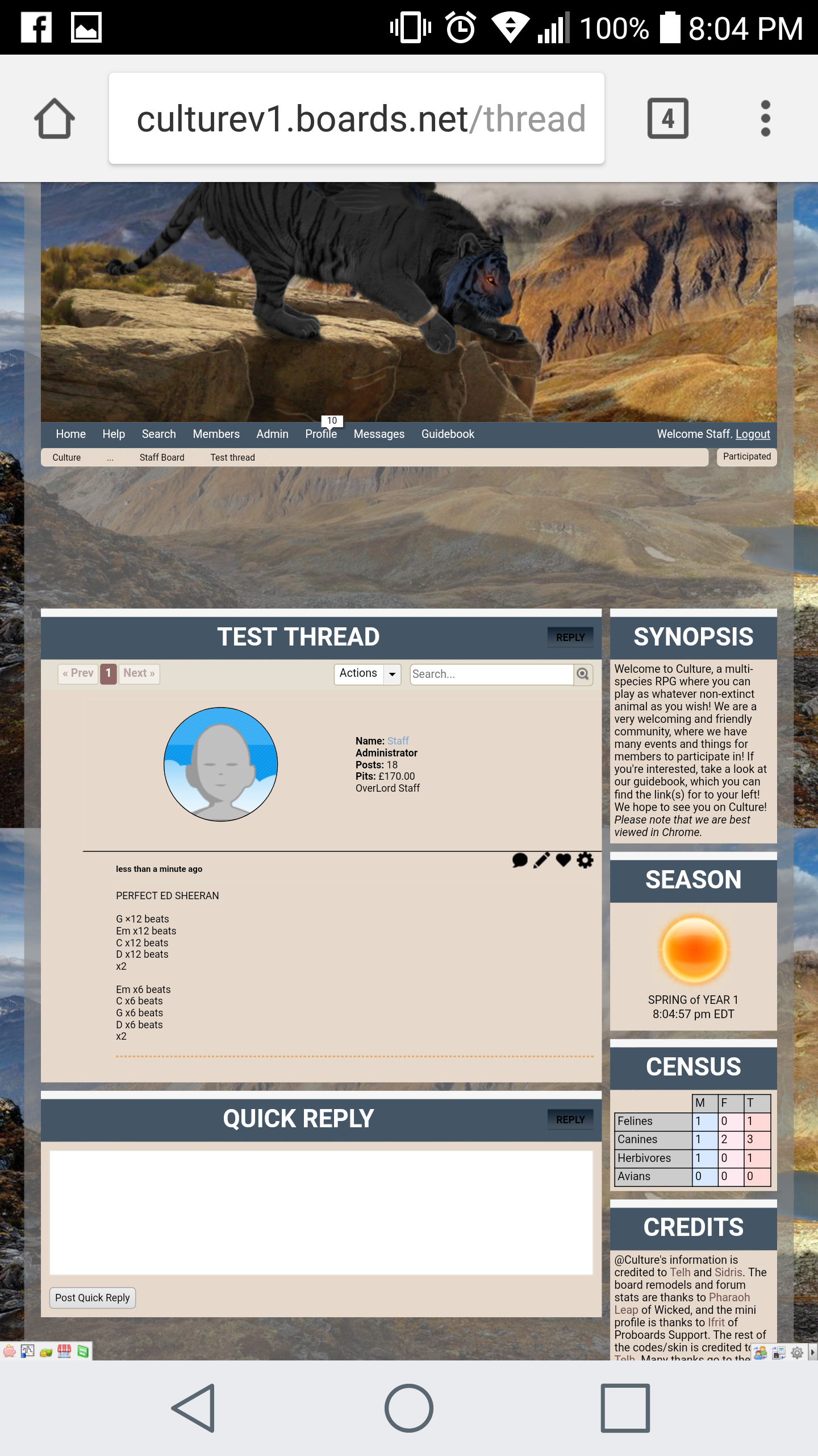 This is what the posting area looks like when someone attempts to post via mobile:  I'm not sure if this is a coding issue or something else, but any and all help would be appreciated <3 |
|
Kami
Forum Cat
Posts: 40,064
Mini-Profile Theme: Kami's Mini-Profile
#f35f71
156500
0
Offline
Jul 24, 2021 11:48:29 GMT -8
Kami
40,064
July 2010
kamiyakaoru
Kami's Mini-Profile
|
Post by Kami on Jun 9, 2018 16:56:27 GMT -8
The reason this is happening is because your side tables are a fixed width and the posting section is not. Because the side tables are a fixed width, they take up an exact number of pixels on your screen, no more, no less, leaving almost zero room for your forum. My recommendation would be to hide the side tables when viewing under a certain width, which can be done by using media queries to trigger specific CSS based on browser width. |
|
telh
New Member
Posts: 27
inherit
255319
0
Apr 3, 2020 15:53:30 GMT -8
telh
27
June 2018
telh
|
Post by telh on Jun 9, 2018 17:06:48 GMT -8
Thank you for getting back at me Kami ! I've never used media queries before, so I'm at a loss on what to do with them. Would it be the same code as W3schools presents, or would it be far more complicated because the sidebar is a plugin? |
|
Kami
Forum Cat
Posts: 40,064
Mini-Profile Theme: Kami's Mini-Profile
#f35f71
156500
0
Offline
Jul 24, 2021 11:48:29 GMT -8
Kami
40,064
July 2010
kamiyakaoru
Kami's Mini-Profile
|
Post by Kami on Jun 9, 2018 17:16:30 GMT -8
Shouldn't be complicated, if I recall correctly. The sidebar plugin should have some CSS to go with it, and there should be an ID or class that encapsulates the entire thing, so if you use the media query as linked above, and then target that ID or class and set it not to display it should work.
So something like (this is not the actual thing)
[media query CSS here] {
#sidebar {
display: none;
}
}
|
|
telh
New Member
Posts: 27
inherit
255319
0
Apr 3, 2020 15:53:30 GMT -8
telh
27
June 2018
telh
|
Post by telh on Jun 9, 2018 17:37:54 GMT -8
Kami I tried some of the basic coding from w3schools (in fact, this one: /* If the screen size is 600px wide or less, hide the element */
@media only screen and (max-width: 600px) {
div.sidebar {
display: none;
}Just to see if it would work, but it didn't do anything. Could you help me with the CSS? I'm not sure what to code it as or where to find the CSS for the sidebars lmao
|
|
Kami
Forum Cat
Posts: 40,064
Mini-Profile Theme: Kami's Mini-Profile
#f35f71
156500
0
Offline
Jul 24, 2021 11:48:29 GMT -8
Kami
40,064
July 2010
kamiyakaoru
Kami's Mini-Profile
|
Post by Kami on Jun 9, 2018 17:49:21 GMT -8
try using .sidebar-right-td instead
EDIT: also you are missing the final closing tag for the media query
/* If the screen size is 600px wide or less, hide the element */
@media only screen and (max-width: 600px) {
  div.sidebar {
    display: none;
  }
^ notice how there isn't a corresponding } for the bracket i marked in red?
|
|
telh
New Member
Posts: 27
inherit
255319
0
Apr 3, 2020 15:53:30 GMT -8
telh
27
June 2018
telh
|
Post by telh on Jun 9, 2018 17:59:33 GMT -8
I added the .sidebar-right-td and the missing bracket, but it still appears to be squished on my phone. However, a member of mine's appears to be fine without the sidebars missing: Link to image
Kami |
|
Kami
Forum Cat
Posts: 40,064
Mini-Profile Theme: Kami's Mini-Profile
#f35f71
156500
0
Offline
Jul 24, 2021 11:48:29 GMT -8
Kami
40,064
July 2010
kamiyakaoru
Kami's Mini-Profile
|
Post by Kami on Jun 9, 2018 18:05:25 GMT -8
There isnt going to be a one size fits all solution to this, I am afraid. Based on what I am seeing, you have two different mobile device resolutions meaning that the one they are using is capable of showing the posting area as intended.
unfortunately, the desktop view is simply not designed or constructed to be viewed on most phones (hence the mobile version); you can mitigate how poorly this appears (hence hiding the sidebar) but most of it is not fixable due to the nature of how the software is currently coded. this will change whenever v6 is released (the posting area will be instead a slide-up "drawer" that can be minimised or expanded) but sadly there is no eta yet on release.
|
|
telh
New Member
Posts: 27
inherit
255319
0
Apr 3, 2020 15:53:30 GMT -8
telh
27
June 2018
telh
|
Post by telh on Jun 9, 2018 18:28:13 GMT -8
Ah okay Kami! I appreciate you spending time to try to help me <3 I can't wait for V6 to come out though <3 |
|
Kami
Forum Cat
Posts: 40,064
Mini-Profile Theme: Kami's Mini-Profile
#f35f71
156500
0
Offline
Jul 24, 2021 11:48:29 GMT -8
Kami
40,064
July 2010
kamiyakaoru
Kami's Mini-Profile
|
Post by Kami on Jun 9, 2018 18:33:17 GMT -8
youre welcome! happy to help
|
|


")
")
")
")
")
")
")
")
")
")
")
")
")