inherit
247932
0
Feb 2, 2018 5:00:23 GMT -8
ltepic
6
August 2017
ltepic
|
Post by ltepic on Aug 5, 2017 13:27:29 GMT -8
Hello guys, I am trying to translate a forum to another language, so I have two quick questions. Is there any way to change the displayed text of the buttons? <div class="profile-user-options controls">
$[options]
$[send_message_button]
$[edit_profile_button]
$[follow_button]
$[invite_button]
</div>...and changing the displayed text on each of these sections in the user profile?  Thanks, LTE |
|
HARP
New Member
 Site in progress of being built!
Posts: 19
inherit
247830
0
Aug 12, 2017 10:21:21 GMT -8
HARP
Site in progress of being built!
19
August 2017
harp
|
Post by HARP on Aug 8, 2017 13:40:59 GMT -8
I tried finding a way to simply change the language of everything on the site at once, but could not seem to find anything. However, I did some playing around and found you can change text individually. The process is a bit complicated, but I will do my best to explain.
NOTE: I only played with profile tabs, not any other buttons. However I am sure the other buttons would require a similar process.
If you need help with those specifically still, let me know and I'll be happy to make specific code and instructions for those as well! But please try on your own first since I am pretty busy building my own forum as well.
In your Layout Templates go to User Profile. Around the top you will see something like this.
<div class="ui-tabMenu">
<ul class="ui-helper-clearfix">
	{foreach $[menu]}<li{if $[menu.active]} class="ui-active"]{/if}><a href="$[menu.href]">$[menu.text]</a></li>{/foreach}
</ul>
</div>
This is what you want for the tabs at the top of each profile page.
To be able to edit each individual part you need to give each individual part a class. As you can see currently there is only one class and it is for only the active tabs
class="ui-active"
But we want more, way more.
To do this we are going to make the class name dynamic and add another. This is done by replacing the {foreach}{/foreach} element. Like so:
{foreach $[menu]}<li{if $[menu.active]} class="ui-active-$[menu.text]"{else} class="ui-inactive-$[menu.text]"{/if}><a href="$[menu.href]">$[menu.text]</a></li>{/foreach}
What this will do is create classes dependent on the original title ($[menu.text])
So now there are classes for each tab in the user profile, both for their active and inactive states.
Now, when you hit save your tabs will appear ruined. But do not worry. This is only because the classes used for them in the CSS no longer exist and need to be edited to look as it should.
Go to Advanced CSS and go to the Style Sheet. This is where you are going to fix the class tags.
Scroll a bit down until you find /* Tabs */. At the bottom of this section you will see code that looks like this:
.ui-tabMenu ul { background: @tabs_background; border: @tabs_border; border-top-width: 0px; border-right-width: 0px; border-left-width: 0px; padding: 5px 5px 0 5px; }
.ui-tabMenu ul li { height: 26px; list-style: none; float: left; top: 1px; margin: 0 2px 1px 0; position: relative; background: @tabs_unselected_background; border: @tabs_unselected_border; .rounded-corners(@tabs_border_radius); }
.ui-tabMenu ul li a { color: @tabs_unselected_text_color; font: @tabs_unselected_text_font; text-decoration: @tabs_unselected_text_decoration; float: left; padding: 5px 14px; white-space: nowrap;}
.ui-tabMenu ul li:hover { background: @tabs_hover_background; border: @tabs_hover_border; .rounded-corners(@tabs_hover_border_radius); }
.ui-tabMenu ul li:hover a { color: @tabs_hover_text_color; font: @tabs_hover_text_font; text-decoration: @tabs_hover_text_decoration; }
.ui-tabMenu ul li.ui-active { background: @tabs_selected_background; border: @tabs_selected_border; .rounded-corners(@tabs_selected_border_radius); }
.ui-tabMenu ul li.ui-active a { color: @tabs_selected_text_color; font: @tabs_selected_text_font; text-decoration: @tabs_selected_text_decoration; border-bottom: 1px solid @tabs_selected_background; }
This is using the original class and identifier names. We need to replace this to get thing looking as they did. Now remember we made dynamic class names. So this means we need to make code for every new class name that was created.
Replace the code above with this:
.ui-tabMenu ul { background: @tabs_background; border: @tabs_border; border-top-width: 0px; border-right-width: 0px; border-left-width: 0px; padding: 5px 5px 0 5px; }

 /* Summary */
.ui-tabMenu ul li.ui-inactive-Summary { height: 26px; list-style: none; float: left; top: 1px; margin: 0 2px 1px 0; position: relative; background: @tabs_unselected_background; border: @tabs_unselected_border; .rounded-corners(@tabs_border_radius); }
.ui-tabMenu ul li.ui-inactive-Summary a { color: @tabs_unselected_text_color; font: @tabs_unselected_text_font; text-decoration: @tabs_unselected_text_decoration; float: left; padding: 5px 14px; white-space: nowrap;}
.ui-tabMenu ul li.ui-inactive-Summary:hover { background: @tabs_hover_background; border: @tabs_hover_border; .rounded-corners(@tabs_hover_border_radius); }
.ui-tabMenu ul li.ui-inactive-Summary:hover a { color: @tabs_hover_text_color; font: @tabs_hover_text_font; text-decoration: @tabs_hover_text_decoration; }
.ui-tabMenu ul li.ui-active-Summary { height: 26px; list-style: none; float: left; top: 1px; margin: 0 2px 1px 0; position: relative; background: @tabs_selected_background; border: @tabs_selected_border; .rounded-corners(@tabs_selected_border_radius); }
.ui-tabMenu ul li.ui-active-Summary a { color: @tabs_selected_text_color; font: @tabs_selected_text_font; text-decoration: @tabs_selected_text_decoration; float: left; padding: 5px 14px; border-bottom: 1px solid @tabs_selected_background; }

 /* Activity */
.ui-tabMenu ul li.ui-inactive-Activity { height: 26px; list-style: none; float: left; top: 1px; margin: 0 2px 1px 0; position: relative; background: @tabs_unselected_background; border: @tabs_unselected_border; .rounded-corners(@tabs_border_radius); }
.ui-tabMenu ul li.ui-inactive-Activity a { color: @tabs_unselected_text_color; font: @tabs_unselected_text_font; text-decoration: @tabs_unselected_text_decoration; float: left; padding: 5px 14px; white-space: nowrap;}
.ui-tabMenu ul li.ui-inactive-Activity:hover { background: @tabs_hover_background; border: @tabs_hover_border; .rounded-corners(@tabs_hover_border_radius); }
.ui-tabMenu ul li.ui-inactive-Activity:hover a { color: @tabs_hover_text_color; font: @tabs_hover_text_font; text-decoration: @tabs_hover_text_decoration; }
.ui-tabMenu ul li.ui-active-Activity { height: 26px; list-style: none; float: left; top: 1px; margin: 0 2px 1px 0; position: relative; background: @tabs_selected_background; border: @tabs_selected_border; .rounded-corners(@tabs_selected_border_radius); }
.ui-tabMenu ul li.ui-active-Activity a { color: @tabs_selected_text_color; font: @tabs_selected_text_font; text-decoration: @tabs_selected_text_decoration; float: left; padding: 5px 14px; border-bottom: 1px solid @tabs_selected_background; }

 /* Following */
.ui-tabMenu ul li.ui-inactive-Following { height: 26px; list-style: none; float: left; top: 1px; margin: 0 2px 1px 0; position: relative; background: @tabs_unselected_background; border: @tabs_unselected_border; .rounded-corners(@tabs_border_radius); }
.ui-tabMenu ul li.ui-inactive-Following a { color: @tabs_unselected_text_color; font: @tabs_unselected_text_font; text-decoration: @tabs_unselected_text_decoration; float: left; padding: 5px 14px; white-space: nowrap;}
.ui-tabMenu ul li.ui-inactive-Following:hover { background: @tabs_hover_background; border: @tabs_hover_border; .rounded-corners(@tabs_hover_border_radius); }
.ui-tabMenu ul li.ui-inactive-Following:hover a { color: @tabs_hover_text_color; font: @tabs_hover_text_font; text-decoration: @tabs_hover_text_decoration; }
.ui-tabMenu ul li.ui-active-Following { height: 26px; list-style: none; float: left; top: 1px; margin: 0 2px 1px 0; position: relative; background: @tabs_selected_background; border: @tabs_selected_border; .rounded-corners(@tabs_selected_border_radius); }
.ui-tabMenu ul li.ui-active-Following a { color: @tabs_selected_text_color; font: @tabs_selected_text_font; text-decoration: @tabs_selected_text_decoration; float: left; padding: 5px 14px; border-bottom: 1px solid @tabs_selected_background; }

 /* Friends */
.ui-tabMenu ul li.ui-inactive-Friends { height: 26px; list-style: none; float: left; top: 1px; margin: 0 2px 1px 0; position: relative; background: @tabs_unselected_background; border: @tabs_unselected_border; .rounded-corners(@tabs_border_radius); }
.ui-tabMenu ul li.ui-inactive-Friends a { color: @tabs_unselected_text_color; font: @tabs_unselected_text_font; text-decoration: @tabs_unselected_text_decoration; float: left; padding: 5px 14px; white-space: nowrap;}
.ui-tabMenu ul li.ui-inactive-Friends:hover { background: @tabs_hover_background; border: @tabs_hover_border; .rounded-corners(@tabs_hover_border_radius); }
.ui-tabMenu ul li.ui-inactive-Friends:hover a { color: @tabs_hover_text_color; font: @tabs_hover_text_font; text-decoration: @tabs_hover_text_decoration; }
.ui-tabMenu ul li.ui-active-Friends { height: 26px; list-style: none; float: left; top: 1px; margin: 0 2px 1px 0; position: relative; background: @tabs_selected_background; border: @tabs_selected_border; .rounded-corners(@tabs_selected_border_radius); }
.ui-tabMenu ul li.ui-active-Friends a { color: @tabs_selected_text_color; font: @tabs_selected_text_font; text-decoration: @tabs_selected_text_decoration; float: left; padding: 5px 14px; border-bottom: 1px solid @tabs_selected_background; }

 /* Groups */
.ui-tabMenu ul li.ui-inactive-Groups { height: 26px; list-style: none; float: left; top: 1px; margin: 0 2px 1px 0; position: relative; background: @tabs_unselected_background; border: @tabs_unselected_border; .rounded-corners(@tabs_border_radius); }
.ui-tabMenu ul li.ui-inactive-Groups a { color: @tabs_unselected_text_color; font: @tabs_unselected_text_font; text-decoration: @tabs_unselected_text_decoration; float: left; padding: 5px 14px; white-space: nowrap;}
.ui-tabMenu ul li.ui-inactive-Groups:hover { background: @tabs_hover_background; border: @tabs_hover_border; .rounded-corners(@tabs_hover_border_radius); }
.ui-tabMenu ul li.ui-inactive-Groups:hover a { color: @tabs_hover_text_color; font: @tabs_hover_text_font; text-decoration: @tabs_hover_text_decoration; }
.ui-tabMenu ul li.ui-active-Groups { height: 26px; list-style: none; float: left; top: 1px; margin: 0 2px 1px 0; position: relative; background: @tabs_selected_background; border: @tabs_selected_border; .rounded-corners(@tabs_selected_border_radius); }
.ui-tabMenu ul li.ui-active-Groups a { color: @tabs_selected_text_color; font: @tabs_selected_text_font; text-decoration: @tabs_selected_text_decoration; float: left; padding: 5px 14px; border-bottom: 1px solid @tabs_selected_background; }

 /* Notifications */
.ui-tabMenu ul li.ui-inactive-Notifications { height: 26px; list-style: none; float: left; top: 1px; margin: 0 2px 1px 0; position: relative; background: @tabs_unselected_background; border: @tabs_unselected_border; .rounded-corners(@tabs_border_radius); }
.ui-tabMenu ul li.ui-inactive-Notifications a { color: @tabs_unselected_text_color; font: @tabs_unselected_text_font; text-decoration: @tabs_unselected_text_decoration; float: left; padding: 5px 14px; white-space: nowrap;}
.ui-tabMenu ul li.ui-inactive-Notifications:hover { background: @tabs_hover_background; border: @tabs_hover_border; .rounded-corners(@tabs_hover_border_radius); }
.ui-tabMenu ul li.ui-inactive-Notifications:hover a { color: @tabs_hover_text_color; font: @tabs_hover_text_font; text-decoration: @tabs_hover_text_decoration; }
.ui-tabMenu ul li.ui-active-Notifications { height: 26px; list-style: none; float: left; top: 1px; margin: 0 2px 1px 0; position: relative; background: @tabs_selected_background; border: @tabs_selected_border; .rounded-corners(@tabs_selected_border_radius); }
.ui-tabMenu ul li.ui-active-Notifications a { color: @tabs_selected_text_color; font: @tabs_selected_text_font; text-decoration: @tabs_selected_text_decoration; float: left; padding: 5px 14px; border-bottom: 1px solid @tabs_selected_background; }

 /* Gift */
.ui-tabMenu ul li.ui-inactive-Gift { height: 26px; list-style: none; float: left; top: 1px; margin: 0 2px 1px 0; position: relative; background: @tabs_unselected_background; border: @tabs_unselected_border; .rounded-corners(@tabs_border_radius); }
.ui-tabMenu ul li.ui-inactive-Gift a { color: @tabs_unselected_text_color; font: @tabs_unselected_text_font; text-decoration: @tabs_unselected_text_decoration; float: left; padding: 5px 14px; white-space: nowrap;}
.ui-tabMenu ul li.ui-inactive-Gift:hover { background: @tabs_hover_background; border: @tabs_hover_border; .rounded-corners(@tabs_hover_border_radius); }
.ui-tabMenu ul li.ui-inactive-Gift:hover a { color: @tabs_hover_text_color; font: @tabs_hover_text_font; text-decoration: @tabs_hover_text_decoration; }
.ui-tabMenu ul li.ui-active-Gift { height: 26px; list-style: none; float: left; top: 1px; margin: 0 2px 1px 0; position: relative; background: @tabs_selected_background; border: @tabs_selected_border; .rounded-corners(@tabs_selected_border_radius); }
.ui-tabMenu ul li.ui-active-Gift a { color: @tabs_selected_text_color; font: @tabs_selected_text_font; text-decoration: @tabs_selected_text_decoration; float: left; padding: 5px 14px; border-bottom: 1px solid @tabs_selected_background; }
I separated each user profile tab into sections to make them easier to see. All I did was update the class tags for each. And had to fix the active tab's values to match the inactive since the no longer reference each other.
You can do a lot of cool things here. Like chance each tab's background and text color. But I am just going to go over how to change their display text. I wish there was an easier direct way to do it, but it has to be complicated and indirect since we can only change them in CSS. I will do my best to explain.
First we are going to want to make the original text invisible and able to have the new text float on top.
Then we are going to want to add and :after element to create the new text.
Like so, these lines should be added to the bottom of each tab section that we just made.
(Change Summary to the respecting tab's name when you put it under each tab's section)
.ui-active-Summary a {visibility: hidden; position:relative;}
.ui-active-Summary a:after {visibility: visible; position: absolute; top: 5px; left: 14px; content: "NAME";}
.ui-inactive-Summary a {visibility: hidden; position:relative;}
.ui-inactive-Summary a:after {visibility: visible; position: absolute; top: 5px; left: 14px; content: "NAME";}
What this does is hide the original text and make it so the new text can be positioned on top of it. However, this does not change the size of the original tab since it is still being effected by the original text! To fix this we need to directly alter the tab's width.
To do this add width:#px; in the brackets of each tab line. You do not need to worry about the :hover
.ui-tabMenu ul li.ui-inactive-Summary
and
.ui-tabMenu ul li.ui-active-Summary
Adjust the width number until it looks right. For me TAB required 60px width.
The new section's code now looks like this:
 /* Summary */
.ui-tabMenu ul li.ui-inactive-Summary { width:60px; height: 26px; list-style: none; float: left; top: 1px; margin: 0 2px 1px 0; position: relative; background: @tabs_unselected_background; border: @tabs_unselected_border; .rounded-corners(@tabs_border_radius); }
.ui-tabMenu ul li.ui-inactive-Summary a { color: @tabs_unselected_text_color; font: @tabs_unselected_text_font; text-decoration: @tabs_unselected_text_decoration; float: left; padding: 5px 14px; white-space: nowrap;}
.ui-tabMenu ul li.ui-inactive-Summary:hover { background: @tabs_hover_background; border: @tabs_hover_border; .rounded-corners(@tabs_hover_border_radius); }
.ui-tabMenu ul li.ui-inactive-Summary:hover a { color: @tabs_hover_text_color; font: @tabs_hover_text_font; text-decoration: @tabs_hover_text_decoration; }
.ui-tabMenu ul li.ui-active-Summary { width:60px; height: 26px; list-style: none; float: left; top: 1px; margin: 0 2px 1px 0; position: relative; background: @tabs_selected_background; border: @tabs_selected_border; .rounded-corners(@tabs_selected_border_radius); }
.ui-tabMenu ul li.ui-active-Summary a { color: @tabs_selected_text_color; font: @tabs_selected_text_font; text-decoration: @tabs_selected_text_decoration; float: left; padding: 5px 14px; border-bottom: 1px solid @tabs_selected_background; }
.ui-active-Summary a {visibility: hidden; position:relative;}
.ui-active-Summary a:after {visibility: visible; position: absolute; top: 5px; left: 14px; content: "TAB";}
.ui-inactive-Summary a {visibility: hidden; position:relative;}
.ui-inactive-Summary a:after {visibility: visible; position: absolute; top: 5px; left: 14px; content: "TAB";}
Repeat this for each tab's section. Be careful to keep the class tags relevant to their name!
To make things a bit easier for you, to just edit the values, I will include the full code here
 .ui-tabMenu ul { background: @tabs_background; border: @tabs_border; border-top-width: 0px; border-right-width: 0px; border-left-width: 0px; padding: 5px 5px 0 5px; }

 /* Summary */
.ui-tabMenu ul li.ui-inactive-Summary { width:120px; height: 26px; list-style: none; float: left; top: 1px; margin: 0 2px 1px 0; position: relative; background: @tabs_unselected_background; border: @tabs_unselected_border; .rounded-corners(@tabs_border_radius); }
.ui-tabMenu ul li.ui-inactive-Summary a { color: @tabs_unselected_text_color; font: @tabs_unselected_text_font; text-decoration: @tabs_unselected_text_decoration; float: left; padding: 5px 14px; white-space: nowrap;}
.ui-tabMenu ul li.ui-inactive-Summary:hover { background: @tabs_hover_background; border: @tabs_hover_border; .rounded-corners(@tabs_hover_border_radius); }
.ui-tabMenu ul li.ui-inactive-Summary:hover a { color: @tabs_hover_text_color; font: @tabs_hover_text_font; text-decoration: @tabs_hover_text_decoration; }
.ui-tabMenu ul li.ui-active-Summary { width:120px; height: 26px; list-style: none; float: left; top: 1px; margin: 0 2px 1px 0; position: relative; background: @tabs_selected_background; border: @tabs_selected_border; .rounded-corners(@tabs_selected_border_radius); }
.ui-tabMenu ul li.ui-active-Summary a { color: @tabs_selected_text_color; font: @tabs_selected_text_font; text-decoration: @tabs_selected_text_decoration; float: left; padding: 5px 14px; border-bottom: 1px solid @tabs_selected_background; }
.ui-active-Summary a {visibility: hidden; position:relative;}
.ui-active-Summary a:after {visibility: visible; position: absolute; top: 5px; left: 14px; content: "SummaryTAB";}
.ui-inactive-Summary a {visibility: hidden; position:relative;}
.ui-inactive-Summary a:after {visibility: visible; position: absolute; top: 5px; left: 14px; content: "SummaryTAB";}

 /* Activity */
.ui-tabMenu ul li.ui-inactive-Activity { width:100px; height: 26px; list-style: none; float: left; top: 1px; margin: 0 2px 1px 0; position: relative; background: @tabs_unselected_background; border: @tabs_unselected_border; .rounded-corners(@tabs_border_radius); }
.ui-tabMenu ul li.ui-inactive-Activity a { color: @tabs_unselected_text_color; font: @tabs_unselected_text_font; text-decoration: @tabs_unselected_text_decoration; float: left; padding: 5px 14px; white-space: nowrap;}
.ui-tabMenu ul li.ui-inactive-Activity:hover { background: @tabs_hover_background; border: @tabs_hover_border; .rounded-corners(@tabs_hover_border_radius); }
.ui-tabMenu ul li.ui-inactive-Activity:hover a { color: @tabs_hover_text_color; font: @tabs_hover_text_font; text-decoration: @tabs_hover_text_decoration; }
.ui-tabMenu ul li.ui-active-Activity { width:100px; height: 26px; list-style: none; float: left; top: 1px; margin: 0 2px 1px 0; position: relative; background: @tabs_selected_background; border: @tabs_selected_border; .rounded-corners(@tabs_selected_border_radius); }
.ui-tabMenu ul li.ui-active-Activity a { color: @tabs_selected_text_color; font: @tabs_selected_text_font; text-decoration: @tabs_selected_text_decoration; float: left; padding: 5px 14px; border-bottom: 1px solid @tabs_selected_background; }
.ui-active-Activity a {visibility: hidden; position:relative;}
.ui-active-Activity a:after {visibility: visible; position: absolute; top: 5px; left: 14px; content: "ActivityTAB";}
.ui-inactive-Activity a {visibility: hidden; position:relative;}
.ui-inactive-Activity a:after {visibility: visible; position: absolute; top: 5px; left: 14px; content: "ActivityTAB";}

 /* Following */
.ui-tabMenu ul li.ui-inactive-Following { width:120px; height: 26px; list-style: none; float: left; top: 1px; margin: 0 2px 1px 0; position: relative; background: @tabs_unselected_background; border: @tabs_unselected_border; .rounded-corners(@tabs_border_radius); }
.ui-tabMenu ul li.ui-inactive-Following a { color: @tabs_unselected_text_color; font: @tabs_unselected_text_font; text-decoration: @tabs_unselected_text_decoration; float: left; padding: 5px 14px; white-space: nowrap;}
.ui-tabMenu ul li.ui-inactive-Following:hover { background: @tabs_hover_background; border: @tabs_hover_border; .rounded-corners(@tabs_hover_border_radius); }
.ui-tabMenu ul li.ui-inactive-Following:hover a { color: @tabs_hover_text_color; font: @tabs_hover_text_font; text-decoration: @tabs_hover_text_decoration; }
.ui-tabMenu ul li.ui-active-Following { width:120px; height: 26px; list-style: none; float: left; top: 1px; margin: 0 2px 1px 0; position: relative; background: @tabs_selected_background; border: @tabs_selected_border; .rounded-corners(@tabs_selected_border_radius); }
.ui-tabMenu ul li.ui-active-Following a { color: @tabs_selected_text_color; font: @tabs_selected_text_font; text-decoration: @tabs_selected_text_decoration; float: left; padding: 5px 14px; border-bottom: 1px solid @tabs_selected_background; }
.ui-active-Following a {visibility: hidden; position:relative;}
.ui-active-Following a:after {visibility: visible; position: absolute; top: 5px; left: 14px; content: "FollowingTAB";}
.ui-inactive-Following a {visibility: hidden; position:relative;}
.ui-inactive-Following a:after {visibility: visible; position: absolute; top: 5px; left: 14px; content: "FollowingTAB";}

 /* Friends */
.ui-tabMenu ul li.ui-inactive-Friends { width:100px; height: 26px; list-style: none; float: left; top: 1px; margin: 0 2px 1px 0; position: relative; background: @tabs_unselected_background; border: @tabs_unselected_border; .rounded-corners(@tabs_border_radius); }
.ui-tabMenu ul li.ui-inactive-Friends a { color: @tabs_unselected_text_color; font: @tabs_unselected_text_font; text-decoration: @tabs_unselected_text_decoration; float: left; padding: 5px 14px; white-space: nowrap;}
.ui-tabMenu ul li.ui-inactive-Friends:hover { background: @tabs_hover_background; border: @tabs_hover_border; .rounded-corners(@tabs_hover_border_radius); }
.ui-tabMenu ul li.ui-inactive-Friends:hover a { color: @tabs_hover_text_color; font: @tabs_hover_text_font; text-decoration: @tabs_hover_text_decoration; }
.ui-tabMenu ul li.ui-active-Friends { width:100px; height: 26px; list-style: none; float: left; top: 1px; margin: 0 2px 1px 0; position: relative; background: @tabs_selected_background; border: @tabs_selected_border; .rounded-corners(@tabs_selected_border_radius); }
.ui-tabMenu ul li.ui-active-Friends a { color: @tabs_selected_text_color; font: @tabs_selected_text_font; text-decoration: @tabs_selected_text_decoration; float: left; padding: 5px 14px; border-bottom: 1px solid @tabs_selected_background; }
.ui-active-Friends a {visibility: hidden; position:relative;}
.ui-active-Friends a:after {visibility: visible; position: absolute; top: 5px; left: 14px; content: "FriendsTAB";}
.ui-inactive-Friends a {visibility: hidden; position:relative;}
.ui-inactive-Friends a:after {visibility: visible; position: absolute; top: 5px; left: 14px; content: "FriendsTAB";}

 /* Groups */
.ui-tabMenu ul li.ui-inactive-Groups { width:110px; height: 26px; list-style: none; float: left; top: 1px; margin: 0 2px 1px 0; position: relative; background: @tabs_unselected_background; border: @tabs_unselected_border; .rounded-corners(@tabs_border_radius); }
.ui-tabMenu ul li.ui-inactive-Groups a { color: @tabs_unselected_text_color; font: @tabs_unselected_text_font; text-decoration: @tabs_unselected_text_decoration; float: left; padding: 5px 14px; white-space: nowrap;}
.ui-tabMenu ul li.ui-inactive-Groups:hover { background: @tabs_hover_background; border: @tabs_hover_border; .rounded-corners(@tabs_hover_border_radius); }
.ui-tabMenu ul li.ui-inactive-Groups:hover a { color: @tabs_hover_text_color; font: @tabs_hover_text_font; text-decoration: @tabs_hover_text_decoration; }
.ui-tabMenu ul li.ui-active-Groups { width:110px; height: 26px; list-style: none; float: left; top: 1px; margin: 0 2px 1px 0; position: relative; background: @tabs_selected_background; border: @tabs_selected_border; .rounded-corners(@tabs_selected_border_radius); }
.ui-tabMenu ul li.ui-active-Groups a { color: @tabs_selected_text_color; font: @tabs_selected_text_font; text-decoration: @tabs_selected_text_decoration; float: left; padding: 5px 14px; border-bottom: 1px solid @tabs_selected_background; }
.ui-active-Groups a {visibility: hidden; position:relative;}
.ui-active-Groups a:after {visibility: visible; position: absolute; top: 5px; left: 14px; content: "GroupsTAB";}
.ui-inactive-Groups a {visibility: hidden; position:relative;}
.ui-inactive-Groups a:after {visibility: visible; position: absolute; top: 5px; left: 14px; content: "GroupsTAB";}

 /* Notifications */
.ui-tabMenu ul li.ui-inactive-Notifications { width:90px; height: 26px; list-style: none; float: left; top: 1px; margin: 0 2px 1px 0; position: relative; background: @tabs_unselected_background; border: @tabs_unselected_border; .rounded-corners(@tabs_border_radius); }
.ui-tabMenu ul li.ui-inactive-Notifications a { color: @tabs_unselected_text_color; font: @tabs_unselected_text_font; text-decoration: @tabs_unselected_text_decoration; float: left; padding: 5px 14px; white-space: nowrap;}
.ui-tabMenu ul li.ui-inactive-Notifications:hover { background: @tabs_hover_background; border: @tabs_hover_border; .rounded-corners(@tabs_hover_border_radius); }
.ui-tabMenu ul li.ui-inactive-Notifications:hover a { color: @tabs_hover_text_color; font: @tabs_hover_text_font; text-decoration: @tabs_hover_text_decoration; }
.ui-tabMenu ul li.ui-active-Notifications { width:90px; height: 26px; list-style: none; float: left; top: 1px; margin: 0 2px 1px 0; position: relative; background: @tabs_selected_background; border: @tabs_selected_border; .rounded-corners(@tabs_selected_border_radius); }
.ui-tabMenu ul li.ui-active-Notifications a { color: @tabs_selected_text_color; font: @tabs_selected_text_font; text-decoration: @tabs_selected_text_decoration; float: left; padding: 5px 14px; border-bottom: 1px solid @tabs_selected_background; }
.ui-active-Notifications a {visibility: hidden; position:relative;}
.ui-active-Notifications a:after {visibility: visible; position: absolute; top: 5px; left: 14px; content: "NotifTAB";}
.ui-inactive-Notifications a {visibility: hidden; position:relative;}
.ui-inactive-Notifications a:after {visibility: visible; position: absolute; top: 5px; left: 14px; content: "NotifTAB";}

 /* Gift */
.ui-tabMenu ul li.ui-inactive-Gift { width:60px; height: 26px; list-style: none; float: left; top: 1px; margin: 0 2px 1px 0; position: relative; background: @tabs_unselected_background; border: @tabs_unselected_border; .rounded-corners(@tabs_border_radius); }
.ui-tabMenu ul li.ui-inactive-Gift a { color: @tabs_unselected_text_color; font: @tabs_unselected_text_font; text-decoration: @tabs_unselected_text_decoration; float: left; padding: 5px 14px; white-space: nowrap;}
.ui-tabMenu ul li.ui-inactive-Gift:hover { background: @tabs_hover_background; border: @tabs_hover_border; .rounded-corners(@tabs_hover_border_radius); }
.ui-tabMenu ul li.ui-inactive-Gift:hover a { color: @tabs_hover_text_color; font: @tabs_hover_text_font; text-decoration: @tabs_hover_text_decoration; }
.ui-tabMenu ul li.ui-active-Gift { width:60px; height: 26px; list-style: none; float: left; top: 1px; margin: 0 2px 1px 0; position: relative; background: @tabs_selected_background; border: @tabs_selected_border; .rounded-corners(@tabs_selected_border_radius); }
.ui-tabMenu ul li.ui-active-Gift a { color: @tabs_selected_text_color; font: @tabs_selected_text_font; text-decoration: @tabs_selected_text_decoration; float: left; padding: 5px 14px; border-bottom: 1px solid @tabs_selected_background; }
.ui-active-Gift a {visibility: hidden; position:relative;}
.ui-active-Gift a:after {visibility: visible; position: absolute; top: 5px; left: 14px; content: "GiftTAB";}
.ui-inactive-Gift a {visibility: hidden; position:relative;}
.ui-inactive-Gift a:after {visibility: visible; position: absolute; top: 5px; left: 14px; content: "GiftTAB";}
I hope this helps!!
If there is an easier way, I could not find it.
I'm sure a Plugin could be made for this too, but that might be even more complicated.
If you have any further questions or problems please feel free to ask!
Also, a cool trick you can do to play with code without messing with the official code is to use Inspect Element if you are using FireFox. I am not sure what other browsers have. But in Inspect Element (get there by right clicking anywhere on the page and slelecting it form the drop down) you can edit and play with both the html and css without pernamently altering your site. There you can even check what parts have what class name.
Have fun! Hope I was able to explain this well enough. c:
|
|
HARP
New Member
Site in progress of being built!
Posts: 19
inherit
247830
0
Aug 12, 2017 10:21:21 GMT -8
HARP
Site in progress of being built!
19
August 2017
harp
|
Post by HARP on Aug 8, 2017 14:14:39 GMT -8
EDIT:
I did not look sorry, but just noticed this effects Edit Profile tabs too!! be sure to edit those as well!!
|
|
inherit
Official Code Helper
65613
0
1
Apr 15, 2024 17:01:41 GMT -8
Chris
"'Oops' is the sound we make when we improve"
8,866
December 2005
horace
|
Post by Chris on Aug 11, 2017 17:59:15 GMT -8
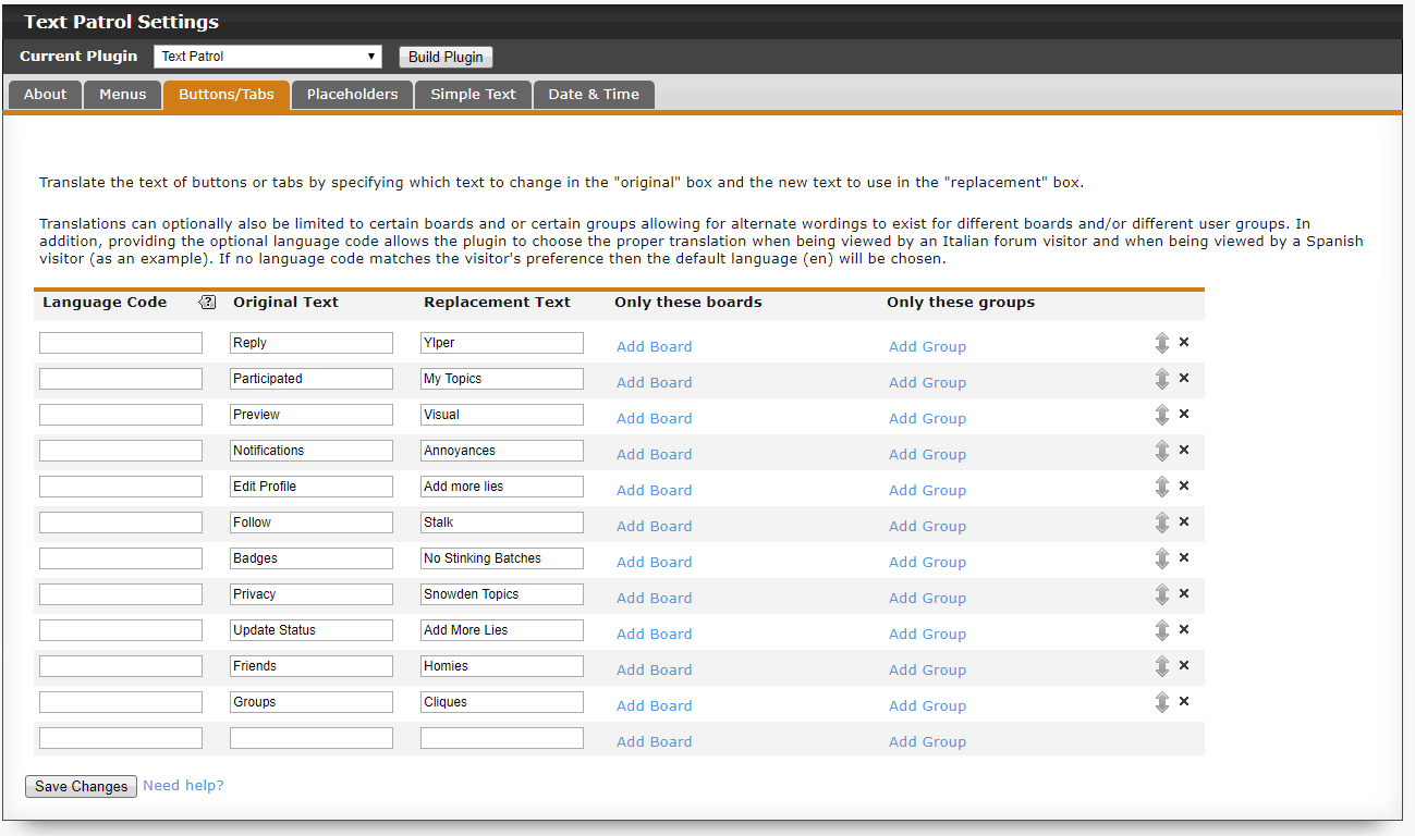
Speaking of plugins (and if that wall of code HARP posted made your eyes glaze over), I'll provide as an alternative a plugin I had started on a few years ago that was meant to provide a one-stop location for translating those hard to reach areas not covered in layout templates but never finished since a couple plugins were released at that time that were meant to do the same thing. I know that one of the plugins (by David Clark ) did not cover tabs at the time but there was some talk that the feature would be added but I just checked the support thread for that plugin before recommending it and noticed that feature is still listed as a future update. So I will give a link to my unfinished plugin which you can download and install to your test forum to see if it can meet your needs. Keep in mind it is unfinished and may likely contain bugs but in that particular area of button and tabs it should be fairly stable. If you decide to try it and have any operational problems or trouble understanding what is required to configure then just drop a post in this thread and I will address them whenever I get the chance. Incidentally, Proboards version 6 will have full internationalization support so this is only a stop gap measure until that version is officially released. |
|
inherit
251442
0
Jan 13, 2018 4:45:52 GMT -8
Bunthorne
4
December 2017
bunthorne
|
Post by Bunthorne on Jan 3, 2018 5:33:07 GMT -8
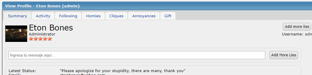
First off, sorry for necroposting. I'd like to use Chris's plugin in my forum, but when I activate it some buttons disappear (pictures in spoiler). I haven't even touched the settings yet, so I have no idea why this is happening. Is there any chance of this being looked into? I would be most grateful. |
|
inherit
Official Code Helper
65613
0
1
Apr 15, 2024 17:01:41 GMT -8
Chris
"'Oops' is the sound we make when we improve"
8,866
December 2005
horace
|
Post by Chris on Jan 3, 2018 12:43:19 GMT -8
Bunthorne , may I have forum link please, that would be the fastest way (and often the only way) to investigate the error/conflict. The images are very helpful but won't show what is going on behind the scenes.... I hadn't gone back and checked for an empty (nothing entered in) settings condition after making a slew of changes the last time I worked on this plugin which resulted in the error shown, you can redownload an updated version with a few more bugs addressed such as abbr.recent_time not getting the 15 second livequery checkup after older date/times were reformatted. |
|


")
")
")
")
")
")
")
")
")
")
")


